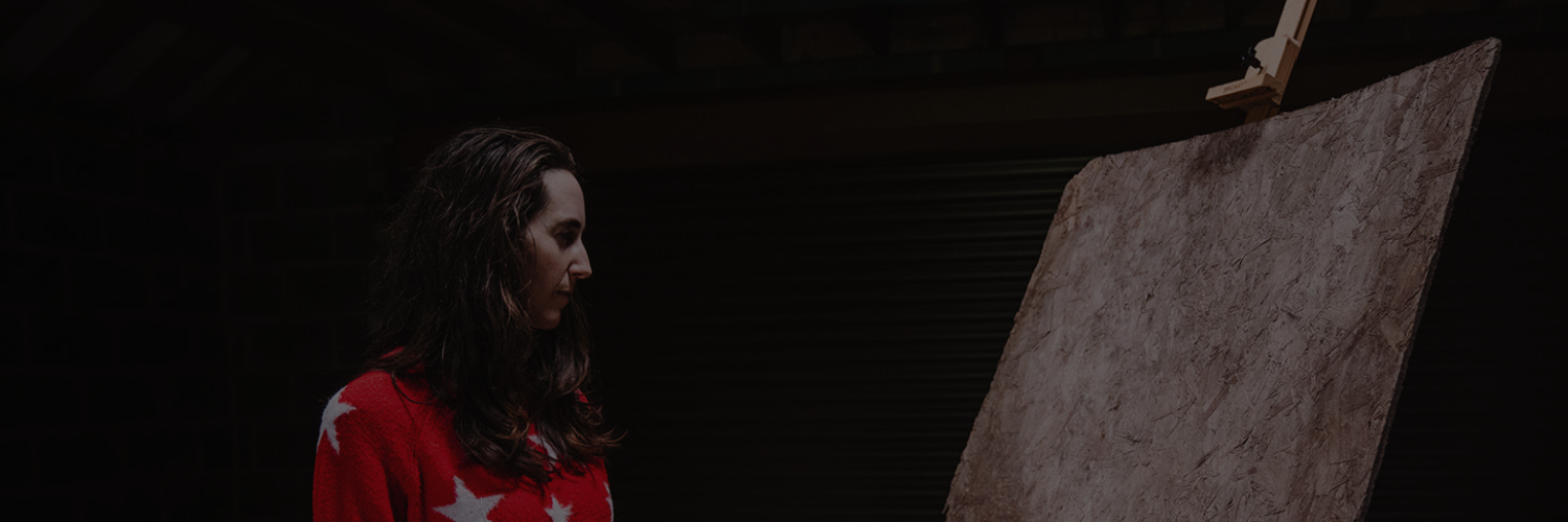

One of my guilty pleasures is reading fairy stories. This habit, combined with an overactive imagination has led to a two year (and counting) exploration of George and the Dragon. This blog post explains the basic process behind creating ‘The Villagers Decide’ and explores the motifs within the work. You’ll learn about the allusions to other artists work used in the composition and why in exploring this folk tale a new lexicon of symbolism has emerged.
The Idea:
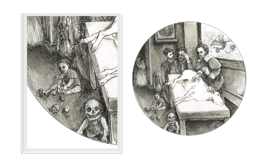
This drawing focusses on the point in the George and the Dragon tale where the villagers run out of sheep. Dragon has decimated the livestock and here, the village elders are pondering what to do next. For those of you who may be unfamiliar with the story, the final battle between George and the Dragon takes when the king is forced to offer his daughter as a sacrifice to the increasingly hungry monster.
In my backstory the villagers move from sheep to children to princesses, in ever escalating appeasement attempts. To convey a sense of dread and inevitability the skull motifs are used on the children and their toys. I wanted to image to have a surreal quality as it is after all, a magical world that the villagers inhabit.

Within the image are two dragons, one flying outside the window, one defeated by George in the picture above, to which the young girl points. This picture references the Southwark Cathedral ‘St. George and the Dragon’ moulding. The sense of danger and disaster is told via the disjointed perspective, the bodies are almost floating in space as the unmade decision hovers in the air.
The Composition:
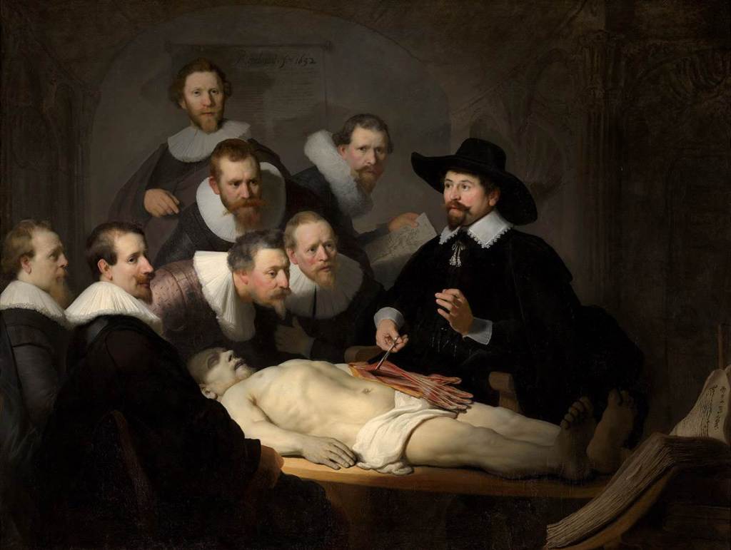
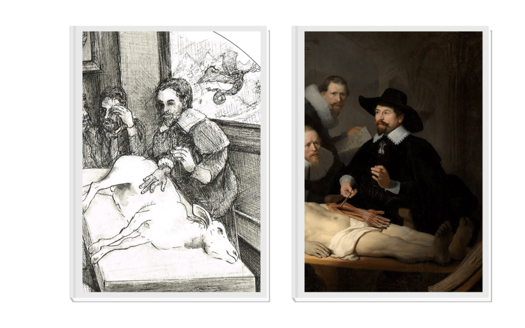
Years back, enjoyed a visit to Mauritshuis Museum in the Netherlands. The collection is incredible and I would highly recommend it. Amongst other treasures, was ‘The Anatomy Lesson of Dr Nicolaes Tulp’, an extraordinary 1632 painting from Rembrandt van Rijn. The chiaroscuro effects alongside the macabre subject matter stayed with me. I referenced both the composition of the open table and the main figure in my drawing.
This series employs circles to contain each segment of the story. The circle is symbolic of infinity and functions as a visual reminder that we know both the beginning and end of this folktale before we read each chapter.
The Practicalities of Drawing:
Using Fabriano paper on board, I used the tried and tested method of commandeering a plate to draw around in pencil (HB), before sketching up the composition. In this case it was a side plate and the resulting circle is 16cm in diameter. After mocking up in pencil I added ink and wash layers, letting that dry before going in with a 0.05mm nib waterproof ink pen to cross hatch and detail the drawing. The majority of the pencil is erased during the ink stage, some remains to add tonality.

The Outcome:
The final drawing is admittedly on the weird side. It was a labour of love, using an intense cross hatching technique to build up the forms. I hope that the drawing conveys the magical, dark world of the village threatened by a dragon. We’ve covered the symbolism in the drawing, how it pays homage to one of my favourite artists and the practicalities involved in ink drawing.
There is always an element of trepidation around sending art out into the world, so I was delighted that this piece was accepted into the RBSA Drawing Prize 2023. The exhibition is open 5 September – 15 October 2023, at RBSA Gallery, Birmingham, UK. Thanks again to the selectors, Barbara Walker, Kate Mason and Steve Bulcock.
While seeing works in the flesh is an unbeatable experience, I hope for those of you who cannot make the exhibition that this has illuminated the process behind the drawing.
REFERENCE LINKS
Rembrandt van Rijn (1606-1669) | Mauritshuis
CHARLIE KIRKHAM NEWSLETTER
Sign up for free and be the first to get notified about updates.


Leave a comment