
Getting the artwork right can make or break your home décor. Here, I’ll walk you through some ideas to use artwork to make your home more beautiful, elegant and inviting.
Here are some simple steps to get you started:
Step One:
Plan for the home you have.
Different properties need different artworks. Think about the layout of the house are there any obvious height or width restrictions? How much sunlight, water or food preparation exposure will the artwork have?
Even the smallest spaces can be breath-taking with the right design. In a studio or open plan context an overarching theme is crucial. The smaller the space the more cohesive the collection needs to be.
In a larger home there’s the option to break artworks into groups and curate each room. If you’re lucky enough to have a garden that’s a whole other ball game…
Think Lifestyle
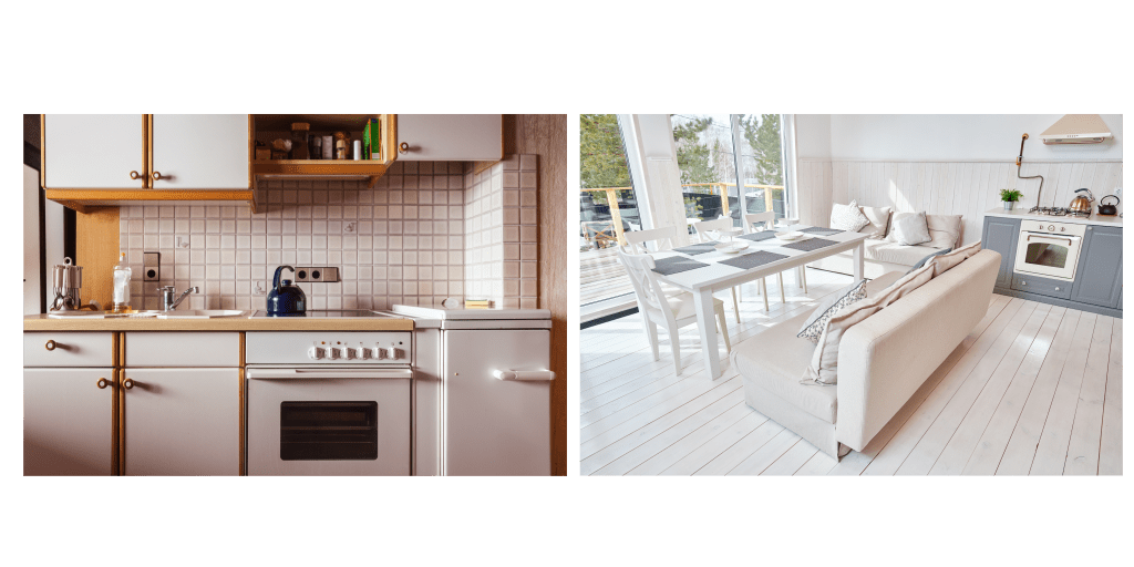
Different properties call for different choices. An open plan ground floor where the kitchen spills into the lounge area might expose artworks to oils or spills from the food prep area. A conservatory will have strong sunlight exposure, making it less than ideal for watercolour or non-lightfast media. There are also our adorable four-legged friends to consider who might knock over sculptures or lean framed work.
What do I mean by ‘plan for the home you have’? Don’t waste time, money and energy buying artwork that doesn’t physically or spiritually fit your home. Each home has its own unique energy, embrace it.

Step Two:
Think colour palette.
Is your kitchen magenta pink and your living room a stunning shade of ultramarine? (please send me photos if it is 😊 ) A bright accent wall with zingy artwork can be stunning.
Think about the walls behind the work. For example, neutrals can be deceptive, a cream based white might make blues pop but clash against paintings with stronger yellow tones. There are two approaches you can take, the first is to paint the walls and then buy the artwork, the second is to buy the artwork and paint the walls to compliment it.
Let’s assume the house is already painted, some of the walls are brilliant white, some are magnolia (standard trade paint colours in the UK). Curating your colours can have an astonishing effect. Here’s an example of one of my wooden artworks against magnolia then against white:

Which pops more?
Mock up how your artworks will look against different colours before painting. If you want to try the artwork against a physical sample Farrow & Ball have painted paper sample cards (189 x 230mm) that work beautifully.

Step Three:
Go room by room…
When you enter the room note where your eyes gravitate to on the walls. This is the position for your accent artwork.
You’ve devoted a lot of time and money to your home, think about what the feeling of each room is. What is the purpose of this room? Who are you entertaining in this room?
Quirky prints might be perfect for a lavatory while intricate, large paintings provide the perfect conversation starter in a dining area. Are there any limitations on the size or medium?

For example, a kitchen with spills and heat suits ceramic works that can be easily wiped down. There’s a gorgeous plate by Georgia Sawers for sale on ArtFinder here.
A low light area is ideal for watercolour works and a stair way might offer more ceiling height than the rest of the house for dramatic statement artwork.
Step Four
Give your collection room to grow. Don’t rush out and buy artwork you’re not fussed about just to fill the space. If you’re not sure use a poster version and a multi-picture frame (Da Vinci Frames hold 50 in A4 or A3) to play around with which work you display.
Think about how your artwork collection will expand. You might start out with a handful of gifted prints. To create something spectacular you don’t need a jaw-dropping budget, or a fantastic level of knowledge. You need the spunk to stick to your home’s spirit and devote the time and energy into making your choices. Be fearless.
Done right, the décor of your home becomes the basis for fabulous accents or décor and artwork.
Unleash your inner spirit and honour what you love. If you think ‘Bubbles’ is the best thing since sliced bread don’t let anyone tell you otherwise.
What other people think of your taste is irrelevant. Go with what YOU love.
Step Five
Consider unified framing.
There’s something about matching frames that instantly pulls a collection together. I’d always recommend buying unframed work and then framing it to suit your home. Get to know a good local framer and ask them what is always in stock so you don’t risk running out of the one you choose.

How to hang it?
To hang or to lean that is the question…
Position artwork so that it meets eye level when you’re seated at a dining table, sofa, or desk. This allows you and your guests the opportunity to really gaze upon it and breathe it in.
Leaning frames is a trendy way to display large work against walls or furniture, or smaller works on shelves. This can be a contemporary take on showing your collection and makes it easy to move and handle works. This looks great on shelves but watch out for trip hazards when leaning lighter works against walls or furniture.
What scale works?
Within the limitations of space available the size or scale of the artwork you choose can greatly impact a room. Don’t be limited by the horizontal display format, remember how the Royal Academy Summer Exhibition in 2012 caused a sensation with a wave hang wall? Why not recreate this at home?

Why not try this at home? Gallery walls also make beautiful features mixing different sized artworks.
You can create an awe-inspiring first impression by thoughtfully curating your artworks. It takes some daring to really seize onto a bold theme and run with it. While you’re building up a collection unifying works through colour palette, theme and frame allows you to move artwork from room to room. It also balances the energies of the house.
Let’s recap on those steps:
- Step One: Plan for the home you have
- Step Two: Think colour palette
- Step Three: Go room by room…
- Step Four: Give your collection room to grow
- Step Five: Unify through framing
Let me know how you get on, it would be great to connect on Instagram or join my mailing list and keep me updated with how it goes.
REFERENCE LINKS
Wooden Picture Frame for 50 Artworks – Mylittledavinci UK
Kitchen art ideas: 10 ways art can uplift your kitchen space | (homesandgardens.com)
Neon Signs for the Bathroom | Illuminati Neon
Summer Exhibition 2012 wave hang
Paint Sample Papers by Farrow and Ball
Ceramic Face Plate by Georgia Sawers
1Stock images from https://www.canva.com/
2https://www.shutterstock.com/
3 The poster child for kitsch and a personal favourite, Millais was widely derided when his painting became the face of Pears’ Soap, more information can be found here https://collections.vam.ac.uk/item/O727113/bubbles-print-millais-john-everett/


Leave a comment